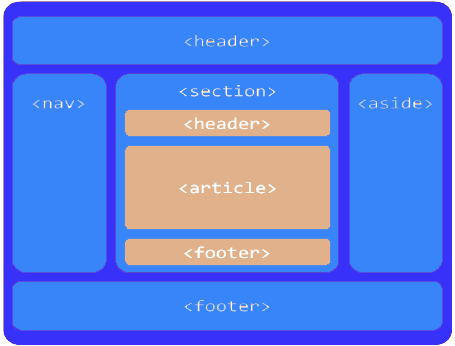
Layout defines how rectangular units are arranged within their container, and how they behave when that container is resized. The border-layout is one that emphasizes a center component, surrounded by header (top), navigation (left), footer (bottom), and aside (right). Basically the HTML 5 archetype is a border-layout. You could also look at the Swing BorderLayout.
When someone wants a border-layout, you need to ask what exactly (s)he means:
From the many possible variants of a border-layout, the following focuses on three things:
In the demo layout below you can click on the buttons to fill the panels with text, so that scrollbars get visible. You can also resize the panel using the bottom-right grip (when your browser supports this).
This layout works without JavaScript. The only CSS properties used are
height, in %width, in %overflowfloatNo other CSS properties are used, no absolute or fixed position, no display options. I decided for float to arrange horizontally, because display: inline-block always showed some paddings or margins.
The CSS overflow is used for several purposes. First it prevents the center text from flowing underneath the west panel (in case west doesn't have 100% height). Second it shows scrollbars when needed. Third it is used to avoid scrollbars on header and footer (could cause content loss when their content overflows).
Space is distributed proportionally, for both vertically and horizontally arranged panels.
You can use this layout also full-page, but mind that you need to make your browser desktop-like then:
      html, body {
        height: 100%;
        padding: 0;
        margin: 0;
        overflow: hidden; /* make browser scrollbar disappear */
      }
Following shows the HTML element hierarchy, including their CSS classes, that is used to build the showcase above.
    <div class="borderLayout">

      <div class="nonFooter">

        <div class="header">
          <span>The Header</span>
        </div>

        <div class="middle"> <!-- contains west, center and east -->

          <div class="aside west">
            <span>West Navigation</span>
          </div>

          <div class="aside east">
            <span>East Aside</span>
          </div>

          <div class="center">
            <span>The Content</span>
          </div>

        </div> <!-- end middle div -->

      </div> <!-- end nonFooter div -->

      <div class="footer">
        <span>The Footer</span>
      </div>

    </div> <!-- end borderLayout div -->
On 1st level there is an element having CSS class borderLayout. This includes all others. Its only child elements are two elements, one with CSS class nonFooter, one with footer. That means header, nav, center and aside are all in the nonFooter element.
On 2nd level there is nonFooter, containing just two elements: header and middle. The middle holds the horizontally arranged west, center and east.
On 3rd level there is west floating left, east floating right, and center in between. Mind that east must be defined BEFORE center, else it would be located below center. The west and east elements also declare class aside, which holds the settings for non-center panels.
So try to put the above code into an HTML file ...
<!DOCTYPE html>
<html>
  <head>
    <meta name="viewport" content="initial-scale=1"/>
    <meta charset="UTF-8"/>
    <title>Title Bar Text</title>
  </head>

  <body>
    <!-- here goes content -->
  </body>
</html>
... and add following style element to its head:
1 | <style type="text/css"> |
In the resulting page, the header and footer always should be visible, while all of west, center and east can be scrolled independently.
You can reuse this element hierarchy and CSS-classes for several nested border-layouts within a page, even nested within each other. Go to my test page to see this both full-page and embedded.
ɔ⃝ Fritz Ritzberger, 2015-12-14