Responsive Layout without CSS media-query
Published: 2014-08-22
Updated: 2014-09-09
Web: https://fritzthecat-blog.blogspot.com/2014/08/responsive-layout-without-css-media.html
Responsive Layout without CSS media-query CSS 3 introduced so-called media queries. Media queries are for finding out on which device the web-app runs. Mostly this is screen-oriented. A media-query is like a switch-case statement, providing place for different CSS layout directives aimed at different screen dimensions. Read on http://css-tricks.com/logic-in-media-queries/ for more details.
A responsive layout is a layout that takes different shapes depending on the capacities of the device it runs on. Such a layout would use media queries. In times of mobile internet usage this has become really important.
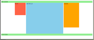
A frequently seen example application of media queries is following layout (desktop): - having a list of titles on the left (contents, kind of nav),
- the articles with those titles centered (article, section),
- and a list of related links on the right (aside).

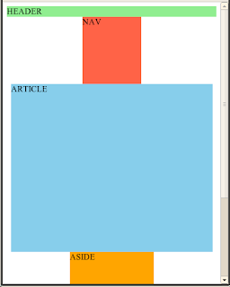
In a mobile browser you would like to have
- the list of titles on top,
- the articles below,
- and the related links on bottom,

because mobiles are mostly used in 'portrait' orientation.
Moreover
- we do not want horizontal scrollbars to show in the mobile layout for the articles part, and we
- always want our content to be centered on screen.
Sounds like we need media queries here!
(Besides, 'media rules' would have been the better term).
In the following I want to show that HTML alone is enough for the described 'responsive' layout. And that this is not bound to HTML 5.
The only restriction is that all responsive blocks must have a defined width, or at least a max-width.
How this works
The CSS directive display: inline-block opens a horizontal layout row. Anything attributed with that directive (except the first one) will be arranged to the right of the preceding element, not below it, even when it is a block element (div, p, ...). Furthermore inline-block leaves the element its own preferred size (other than inline). To terminate such a horizontal layout row you either need a block element (without inline-block) or an element with a CSS directive clear: both.
Now when the browser arranges elements in a layout row, it does not open an horizontal scroll bar when the elements do not fit into the browser window width, it then drops the follower element below its predecessor (responsive by nature :-). Only when the declared width of an element would not fit into the browser width it would show a scrollbar.
How to get everything centered
When you enclose the responsive blocks into a parent div that declares a centered horizontal alignment (CSS text-align: center), all blocks within will be centered, except when you let "float" them explicitly by adding a CSS float: left for the first element, or float: right for the last element.
How to avoid horizontal scrollbar on mobile screen
All responsive blocks needs to have a declared width. But you can use max-width instead to prevent the block from getting to wide (allow smaller width). When doing so, the browser is NOT forced to show a horizontal scrollbar when a block does not fit any more into its width.
CSS
.centercontent {
text-align: center; /* Mind that this sets the default for all child elements! */
}
.floatcolumn {
display: inline-block;
text-align: left; /* Must reset "center" explicitly, inherited from parent. */
vertical-align: top; /* Bind the elements to top, not to bottom. */
}
/* Necessary widths of floating blocks. */
.nav {
max-width: 7em;
}
.main {
max-width: 28em;
}
.aside {
max-width: 10em;
}
HTML
<body>
<div style="background-color: LightGreen;">HEADER</div>
<div class="centercontent">
<div class="floatcolumn nav" style="background-color: Tomato;">NAV (put some content anchor links to here)</div>
<div class="floatcolumn main" style="background-color: SkyBlue;">ARTICLE (copy some "Lorem ipsum ...." to here)</div>
<div class="floatcolumn aside" style="background-color: orange;">ASIDE (put a long vertical list to here)</div>
</div>
<div style="background-color: LightGreen;">FOOTER</div>
</body>
Hint: to make this example code look like the screenshots you need to add either a CSS height to all responsive blocks, or fill them with some "Lorem ipsum ..." demo text.
Making the footer "sticky"
When the content is very short, the footer is not on bottom of the page. Following code shows how to fix this by weaving in a "sticky" footer.
But be aware that margin: 0and padding: 0directives will destroy the predefined browser layout of e.g. lists and many other elements (look for "CSS reset").
For what is that margin/padding zero needed? The browser shows a vertical scrollbar when having 100 % height on htmland body because of its predefined layout settings.
Some people fix this by setting height: 99% ... CSS
* {
margin: 0;
padding: 0;
}
html, body {
height: 100%; /* all containers in DOM above "pagewithoutfooter" MUST be 100 % high! */
}
.pagewithoutfooter {
min-height: 100%; /* use only min-height here, not height */
}
.pageheader {
height: 3em;
width: 100%;
}
.pagecontent {
padding-bottom: 2em; /* must be same as footer height */
text-align: center;
}
.pagefooter {
margin-top: -2em; /* must be negative height */
height: 2em;
width: 100%;
}
.floatcolumn {
display: inline-block;
vertical-align: top;
text-align: left;
}
.nav {
max-width: 7em;
}
.main {
max-width: 28em;
}
.aside {
max-width: 10em;
}
HTML
<body>
<div class="pagewithoutfooter">
<div class="pageheader" style="background-color: LightGreen;">HEADER</div>
<div class="pagecontent">
<div class="floatcolumn nav" style="background-color: Tomato;">NAV</div>
<div class="floatcolumn main" style="background-color: SkyBlue;">ARTICLE</div>
<div class="floatcolumn aside" style="background-color: orange;">ASIDE</div>
</div>
</div>
<div class="pagefooter" style="background-color: LightGreen;">FOOTER</div>
</body>
The result then looks like this (and is still responsive):

ɔ⃝ Fritz Ritzberger, 2014-08-22


