This is
the small size
logo (app. 25mm /
0,95 in), as we know
it from the Mexican or
or old U.S. shots. |
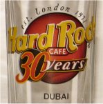
This is
the small size
logo (app. 30mm /
1,15 in), as we know
it from the new red
circle shots. Also the 30
years lettering is
boardered with
yellow lines. |
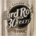
This
logo is slightly
smaller than the Asian
syle (app. 29mm /
1,1 in) and held in black
and white. |
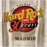
This logo is slightly
smaller than the Asian
syle (app. 29mm /
1,1 in) and has
differences in the colours.
e.g. the words
"Hard Rock" are in
orange, the word years
is on a red background
and the black fading
of the logo is much
darker at
the bottom end.
|
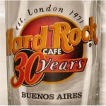
This
logo is slightly
smaller than the Asian
syle (app. 27mm /
1,05 in) and has
differences in the colours.
e.g. the words
"Hard Rock" are in
orange, and the black
fading of the logo
is much darker at
the bottom end. |